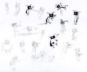
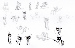
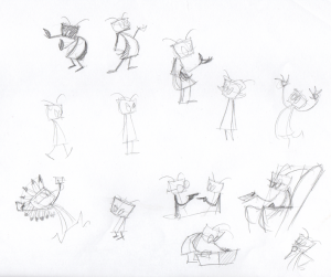
The Saturday Sketch
Hey folks,
Just wanted to let you know that I’m in the process of giving this site a much needed shake-up. I’m starting with the navigation buttons; getting rid of the unnecessary ones and customizing others. I’m also eyeballing those way-too-big icons in the left sidebar. Who makes their twitter link that big? Yeesh.
And, just for fun, I thought I’d start posting some of the sketches I do on the weekends. I’m interested to see if I can make The Saturday Sketch a regular thing. It won’t always be bugs either, though this week’s sketches are pretty much nutin’ but bugs. Maybe next week I’ll take requests.


Very fun! More please
I concur with EVERYTHING
I love this idea.
A Saturday Sketch would be great
Dear Sir, your twitter icon is exemplary and sets a standard for the rest of us. That is mainly because it’s an awesome picture of bug, lending flavour to the page.
Your “Geeks of Steel” icon that doesn’t even have a transparent background, however, could well do with a re-do.
I don’t necessarily agree that “first” and “last” are unnecessary icons, though they might go well with the calendar widget instead of the prime location below the comic.
Glad you dig the twitter icon, but it at least needs to be redesigned to take up less real estate. Same goes for the Geeks of Steel podcast icon.
See, here’s why the “First” and “Last buttons aren’t necessary: If you want to see the first comic you can go to “Archives” and scroll to the bottom. And the “Last” comic can be accessed by clicking on either the “Home” button or the “Bug” title icon (which is also overdue for an update).
Well in favor of the “first” and “last” button, (apart from scrolling down three years of archives being cumbersome and (hopefully) only bound to get more so), most webcomics do have them and a reader who spends time looking for them and doesn’t find them might well not bother. That said, leaving them off is not going to be the end of the world, either.
On my widescreen, there is more than enough “estate” – I can see how mobile users might see that differently, though, so using different icons in each case might be appropriate. Does the strip have a dedicated mobile layout? On the widescreen, the bigness (sounds better than “size”, doesn’t it? “bigosity”?) of the icon kind of offsets the size of the images that try to hawk their wares (or non-bug-related public service messages), so unless you have a plan to use that screen estate (assuming here the plan isn’t “more ads”), why free it?
My thoughts, your site, hope you’re not offended for me having my say – I won’t be offended either, whatever you do. Keep on bugging!
No offense taken whatsoever. Thanks for the input!
Fat bug and bone bug are awesome!
I agree with mendel, you should add back the first and last buttons. They’re useful if you want to quickly jump to the beginning to read the comics in order.
Sir, the “first” and the “last” buttons are totally required for easy navigation.
As for the large icons.. Twitter Icon is exemplary.
Saturday sketch is yet another amazing idea. Keep up the awesomeness!
Completely loving the Saturday Sketch idea, as lng as it doesn’t burn you out too much. Half of the fun of Bug is the amazing expressiveness and positioning of the characters.
I Love the Saturday sketch idea, too! Since I don’t get to bug you while you’re drawing anymore (no pun intended), I’d sincerely enjoy being able to see your cute doodles!
I have a suggestion! Since you’re posting sketches why not make it a sequence? Make a collection of all the bugs that ever shown, and make a big well done sketch of them with names and acessories! There are some pearls that should not be lost, hence atkin bug, kid nerd bug, sunglasses bug, bald bug etc.
That sounds a lot like work.