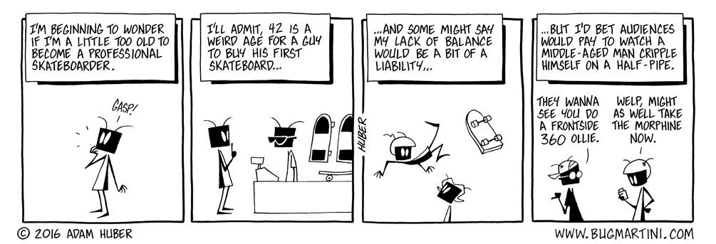
Skating on Old Ice
on October 11, 2016
at 12:14 am
I did get a skateboard for my birthday right around the time Back to the Future came out. Couldn’t even do the trick where you step on the back of the board and it flips up into your hand.


I smashed my teeth as a 6 yr kid. All I can say is good luck my man, you’ll need it.
From age 12 to 16 I bet I put a million miles on mine and I could never do any tricks.
Most of the time I was on my way to work, so I didn’t have time for that malarky, anyway.
And, seeing how I was already on a payroll at 12 I had better hardware than anyone else in the neighborhood.
42. So that explains all the big, friendly letters in this blog these days, eh?!
I could barely stand up on one, much less do tricks. I can’t water ski either. Weak ankles or some such.
About your web design, I would suggest having an alternate url that leads to a mobile version of the site. While this version certainly looks good on mobile, on desktop everything is simply too large. Also, we really need the random button back.
Speaking as a mobile user, I have the same problem. The larger buttons force the text boxes into narrower windows than before, making it awkward to read. Plus the comic itself seems smaller than before, but it won’t let me zoom in on it either.
The same issue – on an iOS device I can’t zoom in, and the cartoon is quite hard to read.
Also, when writing a comment the text is grey on a grey background.
Thanks! ?
Curious, my desktop version looks good, but the mobile version is terrible, with large buttons and small strip, with the zoom functionality off.
Personally, I don’t quite like this version of the site on mobile. Largely because the default size of the comic is a bit too small, and I can no longer resize the site.
Hell, I can’t even do the trick where you step on the board and not die. I’d say you’re ahead of me.
Hi Adam
Thanks for removing all the ads, love it! Even made me join patreon and pledge 5$ to you, since you are not relying on ads anymore. Keep up the great work, thanks.
PS: I do agree, on the Desktop the new layout is just too big when it comes to the text-y parts.
Thank you so much! Yeah, we’re gonna work on tweeking the new site to address that and other issues throughout the next week or so.
Also, what happened to the avatars?
Panel 4 is another T-shirt idea
Bwahahaha! I totally read that last panel as “a middle-aged man-cripple,” implying that Bug already was a cripple in his forties.
Must have been all those years not skating around.
I still have my skateboard hanging up in my garage. Sometimes I’ll even roll around in the driveway with it. But at 50 my arthritis is so bad that even *thinking* of doing anything more daring requires putting my orthopedic surgeon on speed dial.
Also, I really like the colors and font of the new web design. But as other commenters have mentioned, it definitely needs some QA testing on various mobile devices.